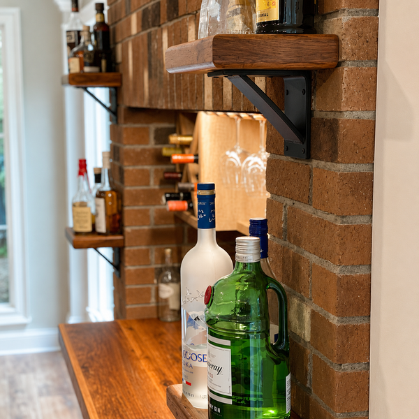
The industrial farmhouse color palette is not a trend choice — it is a materials choice. The colors associated with this style are the colors of the materials: the warm whites and creams of plaster and cotton, the wood tones of oak and pine and reclaimed barn board, the matte blacks and raw grays of steel and iron, the warm tans of leather and burlap. When you choose real versions of those materials, the palette emerges naturally. When you paint everything the right beige without the real materials, it feels like a copy of the style rather than the style itself.
Industrial Farm Co. makes the hardware that anchors the palette in any room. Our decorative metal hooks and hardware read as matte black or raw steel — the industrial anchor colors that give the palette its defining contrast against warm wood and cream textiles. All made in Camillus, New York.
The palette is built around contrast between the hard and the warm: the hard side is the steel, iron, concrete, and matte black hardware. The warm side is the reclaimed wood, natural textiles, stone, and organic forms. The neutral palette is what lets both sides read clearly without competing — a white or cream wall is a backdrop, not a color choice.
Understanding this logic helps when making specific color decisions. If the wall is neutral, the floor is wood-toned, and the hardware is matte black, you have the complete industrial farmhouse palette without adding any decorative color. Accent colors — a warm terracotta, a muted sage, an earthy mustard — work as accessories to this foundation, not as the palette itself.
Neutral Foundations
The most important choice in the palette is the neutral you use for walls and large surfaces. The industrial farmhouse style uses warm neutrals, not cool ones:
Warm whites and cream: The most versatile and widely used foundation. Look for whites with yellow, red, or beige undertones rather than blue or gray. Cool whites push the room toward Scandinavian contemporary rather than industrial farmhouse.
Warm gray: A gray with brown or yellow undertones (a “greige”) rather than a blue-based gray. Use for accent walls, cabinetry, or spaces where white would feel too bright.
Natural wood tone: Floors, exposed beams, and furniture surfaces contribute warm brown tones that are part of the palette. No painting required — the material provides the color.
The right neutral for this palette reads as warm, not stark, with texture that adds visual depth. Choose a paint with a cream or beige undertone and test it against the wood tones and matte black hardware in the room before committing.
Color Accents
Color accents in an industrial farmhouse room should feel like they came from the natural world rather than from a paint chip card. Earthy, muted, and organic:
Terracotta and warm clay: In planters, pottery, textiles, or a single accent wall. The natural earth pigment connects to the farmhouse sensibility directly.
Sage and muted olive green: From plants first, then from textiles and accessories. One live plant in a room does more for this palette than any amount of sage-colored objects.
Deep mustard and warm amber: In small doses as accent textiles or a single object. Too much yellow pushes the room too warm; too little reads as accidental.
Aged brass: Not a bright gold but the dull, matte version that develops on real brass over time. A few aged brass fixtures or handles against matte black hardware is a classic combination in this style.
Natural Elements and Texture
Natural elements add color as a side effect of being their material selves. Stone countertops and backsplashes bring gray and cream tones with natural variation. Plants bring green and organic form that no decorative object replicates. Woven baskets bring warm tan. Unfinished or raw-edge wood brings grain variation that a painted surface never has.
Our decorative metal hooks and hardware bring the gray-black industrial tone that anchors the palette against these warmer natural elements. The contrast between the steel gray and the warm wood or cream textile is the defining visual of the style.
Finishes and Surface Treatments
Matte finishes on walls: Matte paint absorbs light rather than reflecting it, which creates the soft, contemporary feel the style is known for. Eggshell is the practical minimum for walls that need to be cleaned; flat matte is for ceilings only.
Distressed or aged finishes on furniture and accessories: Furniture pieces with visible grain, natural aging, or a distressed surface finish read as authentic. Overtly shiny furniture finishes conflict with the style’s material honesty.
Mixed textures: Smooth steel against rough reclaimed wood against soft linen textile. The texture variation is as important as the color variation in making the palette feel rich rather than flat.
Bringing It Together
The test for whether your palette is working: stand at the door of the room and look at it. Do you see neutral walls, natural wood tones, matte black or steel hardware, and a few accent objects? Does the room feel warm without feeling busy? Can you identify the materials rather than just the colors?
If the room is reading too cold: add a warm textile, more wood, or a plant. If it’s reading too dark: check whether the overhead lighting is warm enough (2700-3000K) and whether the neutrals on the walls are truly warm rather than cool. If it’s reading too busy: remove one accent color or object category and simplify.
Room-by-Room Palette Notes
Kitchen: Cream or warm white walls and upper cabinetry. Natural wood or butcher block countertop as the warm element. Matte black hardware throughout. Open shelving on steel brackets with natural wood boards.
Living room: Neutral walls. Natural wood floors or a jute rug on harder floors. One piece of furniture in a natural linen or cotton in a complementary neutral. One or two terracotta or sage accent objects, not an entire color scheme.
Bedroom: Warm white walls. Natural linen bedding in cream or soft gray. One aged brass or weathered metal accent — a lamp, a small mirror, a wall hook. The bedroom version of this palette should feel the warmest of any room in the house.
Bathroom: Warm white walls and fixtures. A sealed hardwood shelf board in natural wood tone. Matte black hardware throughout. One natural element — a small plant, a wooden soap dish, a woven basket.
What colors define the industrial farmhouse palette?
The palette is built from material colors rather than decorative color choices: warm whites and creams from walls and textiles, natural wood tones from floors and furniture, matte blacks and raw grays from steel and iron hardware, and the warm tans of leather and natural fiber. Accent colors — terracotta, sage, mustard, aged brass — work as accessories to this foundation. The style's palette feels like the natural colors of honest materials rather than a curated color scheme.
What wall color works best for industrial farmhouse style?
Warm whites and creams with yellow, red, or beige undertones rather than cool blue-gray whites. Warm whites allow the natural wood tones and matte black hardware to read clearly against a neutral backdrop. Cool whites push the room toward Scandinavian contemporary rather than industrial farmhouse. If a deeper tone is wanted, a warm greige (gray with brown undertones) on cabinetry or an accent wall is the natural next step.
How do you add color to an industrial farmhouse room without losing the aesthetic?
Use color as an accessory to the palette, not as the palette. One accent color at a time: terracotta in planters and textiles, or sage green in plants and a throw pillow, or aged brass in a lamp and a few handles. Keep the walls, large furniture, and hardware in the neutral foundation and let the accent color appear in objects you can change. The most effective color addition is always a live plant.
What is the difference between warm white and cool white in interior paint?
Warm whites have yellow, red, or beige undertones and reflect the warm end of the spectrum. They appear cream or ivory in certain lights. Cool whites have blue or gray undertones and appear crisp or bright in most lights. For industrial farmhouse style, warm whites are correct: they complement wood tones, natural textiles, and aged metal finishes without creating the cool contrast that feels contemporary rather than farmhouse.
How do you use matte black in an industrial farmhouse room?
Matte black is the hardware color throughout: shelf brackets, cabinet pulls, coat hooks, towel bars, light fixtures, and faucets. Use it consistently across all hardware in a room so it reads as an intentional palette element rather than a finish choice on a single piece. Matte black against natural wood is the defining color contrast in industrial farmhouse design.